
Linear - Row & Column
Stack children left-to-right or top-to-bottom with gaps, alignment, and distribution. Drop a Fill spacer between siblings to push the rest to the edge. Toolbars, menus, lists - most screens.

Ready to dig in? Get Started walks you through install and your first layout.
One component, one Inspector - everything in one place. Sizing, layout, spacing, alignment, scrolling, and transitions all live on a single AutoLayout component, edited visually in a clean Inspector. No stacking LayoutGroup + ContentSizeFitter + LayoutElement to get one row to behave. It coexists with Unity’s existing layout, so you can adopt it one screen at a time - no rewrite required.
Four layout building blocks cover almost everything - and when they don’t, you write your own. Sizing is the orthogonal dimension that runs through all of them.
Linear - Row & Column
Stack children left-to-right or top-to-bottom with gaps, alignment, and distribution. Drop a Fill spacer between siblings to push the rest to the edge. Toolbars, menus, lists - most screens.
Grid
A real CSS Grid: template tracks, repeat(), column/row spans, dense packing, and auto-flow - not Unity’s GridLayoutGroup. For dashboards, galleries, anything 2D.
Absolute
Pin elements to edges or cover the parent - badges, overlays, popovers, backgrounds. For everything that shouldn’t flow with Row, Column, or Grid.
Custom - write your own
When Row, Column, and Grid don’t fit, implement IHeadlessCustomLayoutAlgorithm for radial, hex, or polar layouts. The engine handles sizing; you place the children.
Sizing, per axis
Each axis picks a mode: Fixed, Hug, Fill, Percentage, AspectRatio, TextSize. Figma’s vocabulary - Hug shrink-wraps, Fill shares free space - independent of which layout you use.
Every feature is set up right in the Inspector - each clip shows the editor workflow, with the equivalent code beside it if you’d rather drive it from script.
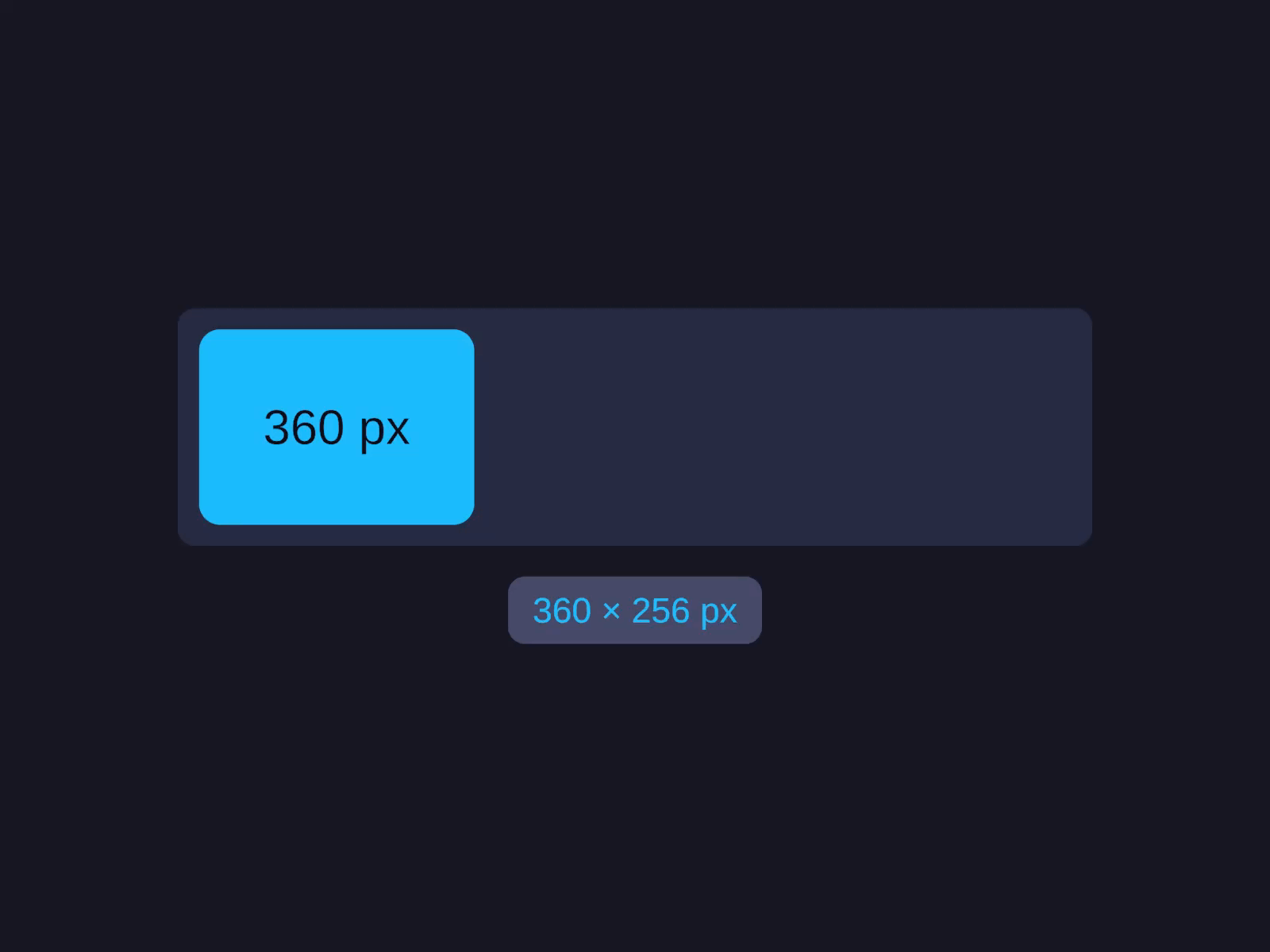
One card, one axis, every mode. Watch its Width step through Fixed (360 px), Hug, Fill, and AspectRatio - the rect resizing smoothly while a live pixel readout tracks each result. The same vocabulary you already use in Figma.
// Each axis picks one of six modes:layout.Width = UIDimension.Pixels(120f); // fixed pxlayout.Width = UIDimension.Hug(); // shrink-wraplayout.Width = UIDimension.Fill(); // share free spacelayout.Width = UIDimension.Percentage(50f); // half the parentlayout.Height = UIDimension.AspectRatio(1f); // squarelayout.Width = UIDimension.TextSize(); // intrinsic text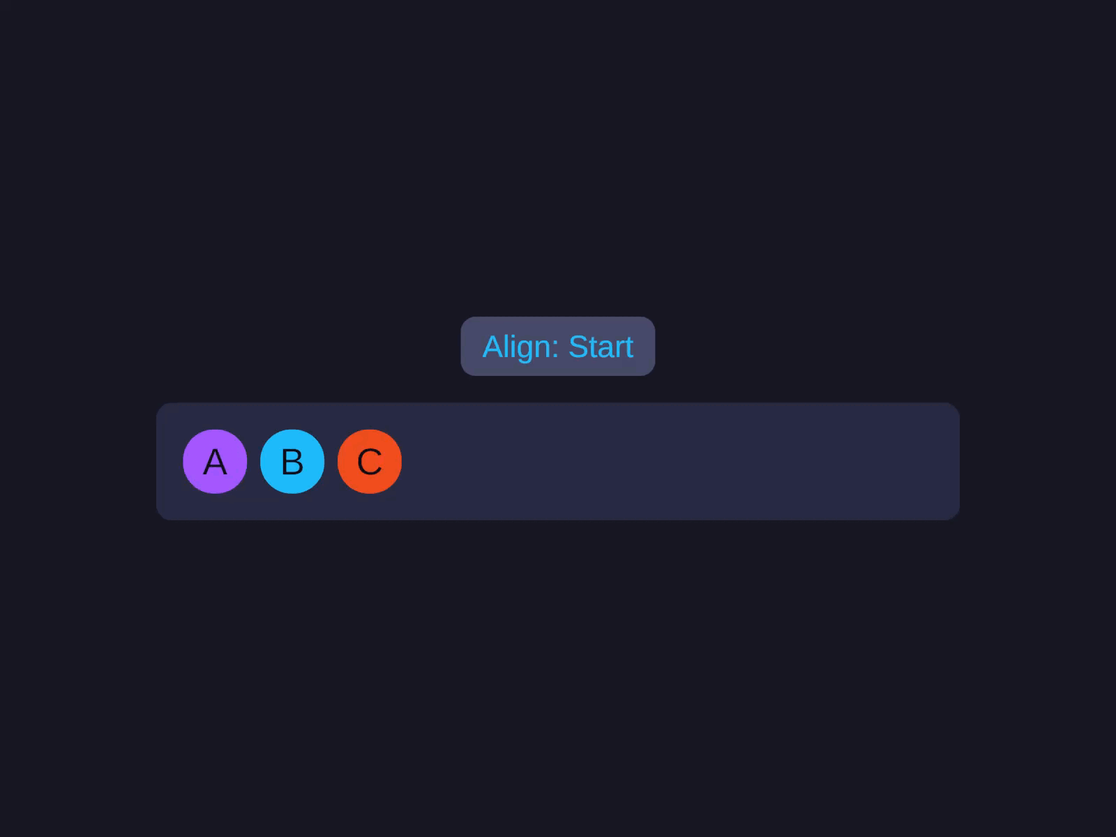
A row of chips reacting as you turn the knobs: alignment shifts Start to End, the Gap opens to 80, and when they overflow the row Wraps to a second line. Every container setting, visual and immediate.
row.LayoutType = LayoutType.Row;row.Gap        = 8f;          // space between children
// Padding insets the container's children:row.PaddingLeft = 16f;row.PaddingTop  = 16f;
// A Fill child eats free space, pushing the rest to the edge:spacer.Width = UIDimension.Fill();
// Margin is an outset on one child, without touching Gap:badge.MarginRight = 8f;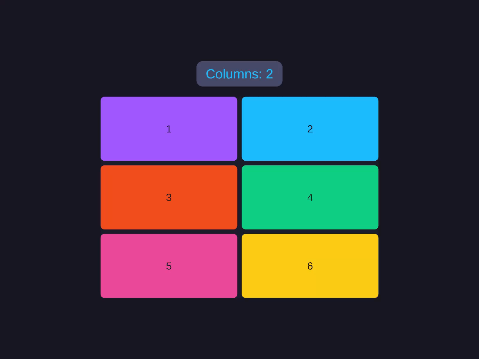
A grid of tiles re-flowing in real time: the column count changes, the tracks retune to 1f 2f 1f 2f, and a tile spans two rows to claim a hero slot. Template tracks, spans, and auto-flow - not Unity's GridLayoutGroup.
table.LayoutType = LayoutType.Grid;
// Columns alternate wide label / narrow value:table.ColumnSizes = "2f 1f 2f 1f";// Fixed-height header row, body rows fill:table.RowSizes = "48 1f 1f 1f";
table.ColumnGap = 8f;table.RowGap    = 4f;
// Pin the header to the top row, spanning all columns:header.GridRow        = 0;header.GridColumnSpan = 4;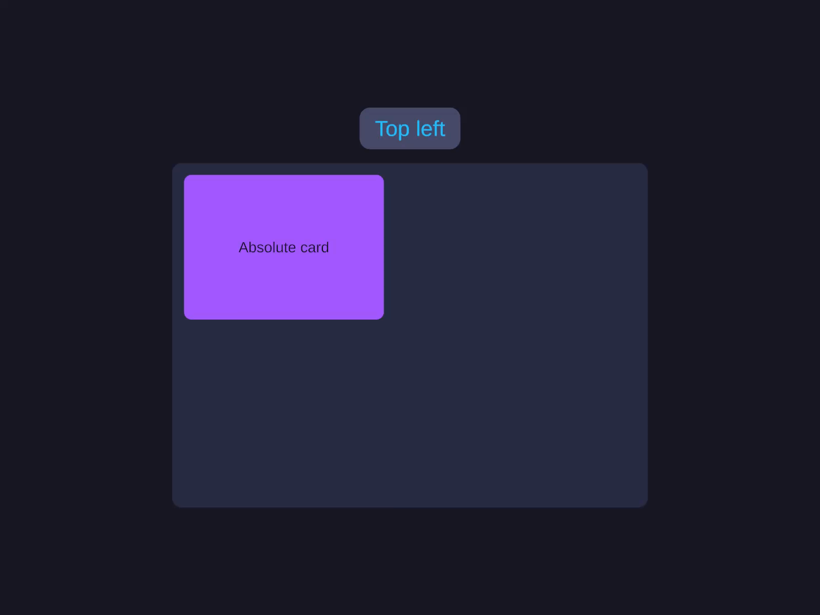
One card, pinned every which way: snapped to the top-right corner, centered, stretched to fill the height, then covering the whole parent for a backdrop or modal scrim. All outside the Row/Column/Grid flow.
// Pin a badge 6px past the card's top-right corner:badge.Placement            = Placement.Absolute;badge.VerticalConstraint   = AxisConstraint.Start(-6f);badge.HorizontalConstraint = AxisConstraint.End(-6f);
// CoverParent stretches over the parent - a full-bleed scrim:scrim.Placement = Placement.CoverParent;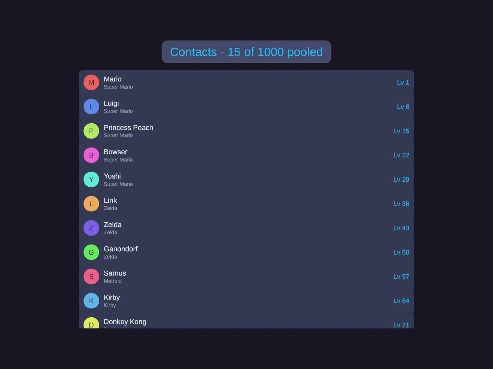
A 1,000-row contacts list and an inventory grid scroll past, and the counter never lies: only ~18 cells of 1,000 ever exist at once. ListView and GridView pool and recycle, so huge data sets scroll as smoothly as ten.
list.ItemCount       = items.Count;list.GetItemCallback = GetItem;
// Point at a method, no lambda:list.BindItemCallback = BindRow;
list.RefreshItems();